NYU Langone Health
City Health Dashboard, Identity and Website
Visit︎Group was tasked with:
Brand Management, Digital Strategy, Information Architecture, Design, and Site Development
2017 – 2018
Highlights:
- Responsive Design
- Multiple Layers of Data Visualization
- NYU Langone Health Brand Extension
- Logo and Brand Identity
Team: Sarah Coles Webb, Kristina Bjoran, Jenn Johnson, Tim Shaw

Background
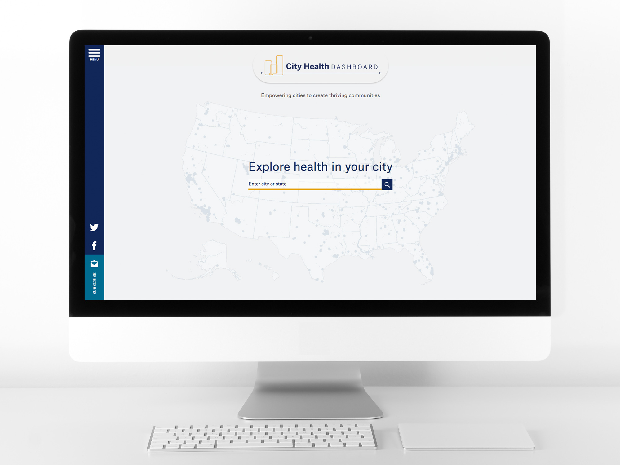
In 2017, with funding from the Robert Wood Johnson Foundation, the Department of Population Health at NYU Langone Health set out to create a resource that would, “equip cities with a one-stop resource for comprehensive, reliable data to help them build healthier and more equitable communities.”The resulting resource was the reimagined City Health Dashboard. Across the United States, city leaders at various levels can now see how their city stands nationally on 36 metrics and can drill down to the census tract and/or demographic group level for many. Users can also compare their city to other cities or others with comparable characteristics, and can compare two metrics to each other. The dashboard provides powerful information for supporting positive change.
Goals
Using the previous work the team had done with the University of Wisconsin on the County Health Rankings (CHR), we worked with existing NYU Langone Health Visual Identity and Design Guidelines with the aim of creating a simple, clean, modern counterpart to the CHR site.By maintaining its firm goal to improve healthcare outcomes, NYU was able to follow a barometer of success that provided a clear design foundation from which all else flowed.
A large part of our focus was on our users: city leaders – mayors and staff, city councilors and staff, department leads, and those working in neighborhoods in both public and private capacities. We wanted to always keep in mind how they would be accessing and using the data.
Opportunity
The opportunity included creating a “Phase 1” foundational product, with the primary focus being a scalable design that could grow and expand for years to come. We also wanted to make sure it was responsive and could function as a mobile application as well.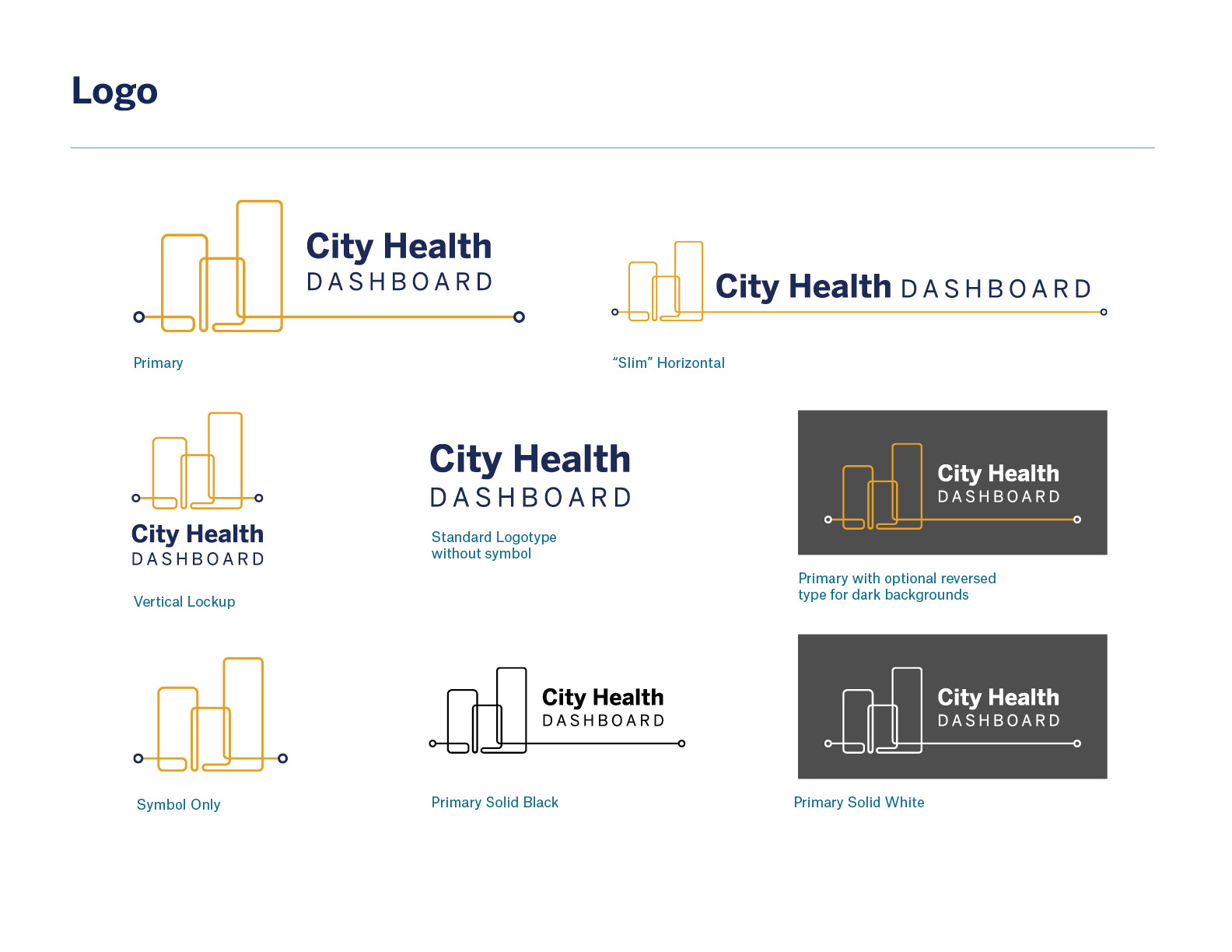

Creating a Hierarchy
Because the data was complex, creating a visual hierarchy was a key aspect of guiding users through the experience. Establishing a visual and data hierarchy meant creating a consistent structure that would govern how all information was organized and presented.We designed the City Health Dashboard pages to maintain a data hierarchy from broad to specific, starting with the city level and drilling down into metrics and more specific data points.
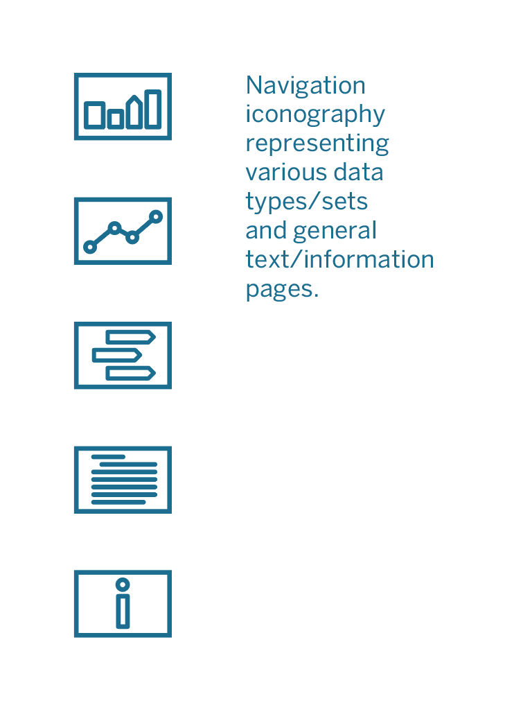
Create a Visualization Language
With large data sets and multiple views, it was critical that audiences be able to quickly and easily grasp any sort of visualization that was being shown. We deliberately limited the number of visualization types and established commonalities between them. In doing so, we created a defined visualization language that audiences could quickly start to recognize, follow, and understand. I oversaw the visual language that heavily evolved as we continued to better understand the data and how it was being aggregated.Conclusion
As the data gets more complex, the need for structures that shape and guide the experience of that data becomes increasingly acute. The site is being continuously expanded on the back-end, and the design system continues to scale as well.